Tuesday 30 June 2015

How to choose a SaaS design platform


Let’s start with a throwback to 1997 when the Web design process required expensive graphic design software and lines of code in Notepad. When you finally did launch something, your server was at the mercy of an Internet full of sketchy hackers.
Fortunately, those days are gone—long gone.
The Web design space is more mature now than it ever has been. In fact, it’s a $20 billion dollar industry. You can go download a template, hire a web designer for something custom, or use software-as-a-service (SaaS) to DIY. The bottom line is that you have options for any budget, and all are good.
However, the increase in options can often complicate things, especially if you are planning to create your own website. That’s why DIY options still only hold three percent of the Web design market, which is a testament to the fact that in the SaaS world, there is no such thing as a ‘one size fits all’ solution.
codefree_520x272_v01
The bottom line is that you need to choose an option that’s right for the specific challenges that you’re looking to tackle. With this mindset, you’ll also save a lot of money. Find the right SaaS design tools by following these steps.

Step 1: Know your buyer persona

Choose the right tool by putting yourself through a process that these companies’ marketers are following in their own targeting efforts—buyer persona development.
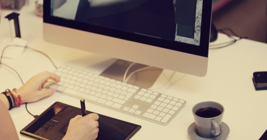
If you’re a programmer but not a designer, you’ll get the most value from working with a template. If you’re strong with UX, you might need to hire someone or find a solution to help with your brand identity. If you’re a strong designer without coding experience or prefer not to mess with coding, you’ll find value in a platforms like Webydo.
designerz
The bottom line is that no SaaS product will be everything to everyone. Know what you need so that you can laser-focus on the solution that’s right for you.

Step 2: Cover your technical bases

The evolution of digital has introduced a number of complexities to the Web design process—the biggest being security, privacy, and compliance. Legal speak aside, you need to make sure that you’re taking steps to keep your customers safe.
You shouldn’t procrastinate compliance.
You’ll want to be sure that there are no known vulnerabilities with your website.
One of the most effective ways to cover your bases, especially if you’re a solo designer, is to work with a third-party, cloud-based partner that works with thousands of customers like you.

Step 3: Research whether the platform can grow with you

Choose a SaaS tool that is designed to help you—and your customers—grow your business.
At a minimum, you should have full branding power and control, ability to service multiple clients, and a strong support experience. You should also trust that your website will always load quickly and that it will be responsive to any device.
designer
Whether you’re creating a website for yourself or for one of your clients, your platform should be able to evolve alongside your growing business.

Step 4: Figure out who’s building your product

Human relationships are the key to success with SaaS software.
As you learn how to use your web design tool, you’ll likely need support and guidance along the way. Unexpected scenarios come up often, and when you need answers, you’ll need them fast. You’ll also want to make sure that the company with whom you’re doing business understands your pain points, challenges, and needs.
At a bare minimum, the people behind your SaaS software need to care. Webydo, for instance, is built by designers, for designers, around the pain points that designers face. Webydo’s community of designers has been integral in the evolution of the platform, with over 450 suggested features implemented as a result of the feedback.
It’s important to choose partners who build because they care. After all, at the end of the day, great products are built, at least in part, on empathy.

Final thoughts

It’s easy to say that the Internet is going through a “SaaS revolution.” The reality, however, is that makers, creators, and builders are experiencing much more. Thanks to technology, people have the flexibility and resources to leverage and laser-focus their skills. The ability to write code is no longer the cornerstone of creation. Do what you love, create amazing designs, and leave it to SaaS tools to do the building on your behalf.
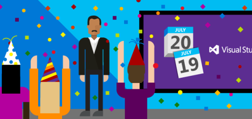
Microsoft’s Visual Studio 2015, Team Foundation Server 2015 and .NET 4.6 land on July 20

Developers, developers, developers! Microsoft’s Visual Studio 2015 will be finalized on July 20th, alongside .NET 4.6 and Team Foundation Server 2015.
The development tool lands just nine days before the release of Windows 10and contains a ton of new features.
It includes cross-platform mobile development for adapting iOS and Android apps to the Windows platform, game development with Unity and Unreal support as well as tools for building Windows 10 apps.
Microsoft is planning a launch event to celebrate, at 8:30AM Pacific Time, so you can get the latest on everything new with Visual Studio.

Google Earth turns 10, gets new exploration features and Earth View images

It’s Google Earth’s 10th  birthday today, so Google is celebrating with a few new features to help you explore some more cool sights around the wold.
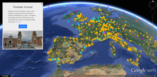
A new layer called Voyager (currently only available on the desktop) helps you quickly jump straight to some of the most interesting locations around the world, and is made up of five different sections
voyager
Street view will showcase some of the best locations to explore at street level, while Earth View will highlight some of the best landscapes as seen from space. Meanwhile, new satellite imagery provides a map of some of the newest overhead location photos, and 3D cities show of some of the best renderings of cities and towns.
You can also access a highlight tour that will surface top locations from thousands in Voyager’s database.
Google is also expanding its Earth View image collection to 1,500 landscapes from around the globe. You can add these to your new tabs in Chrome via Google’s own extension, or make them your wallpaper by downloading from the new Earth View Web gallery.
➤ Google Earth turns 10 today [Google Official Blog]

Braille and typography – past, present and future


For almost 200 years, the Braille system has helped the visually-impaired read. Created by Louis Braille in the 1820’s after he lost his sight, the system uses embossed dot combinations to represent letters, numbers and punctuation (64 combinations made with 6 dot cells, spelling out every letter of a word, and more combinations representing contracted signs).
Today, technology is helping the visually impaired go beyond using just books, with special displays, computer assistance, and even apps, such asBraille Touch.
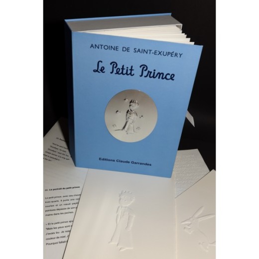
le-petit-prince_ReliefBook
Despite Braille having a similar path to any other form of typography, it has changed little since its inception. Now however, this is starting to change. Although it was created to fill a need for blind people, tactile typography may apply to others, as long as they have hands ;).

The above video shows how Wimpy, an American burger chain, used sesame seeds to tell blind people that they produced a Braille menu.
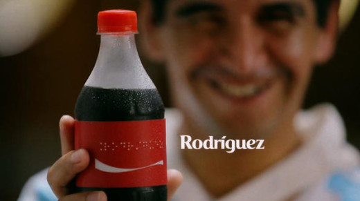
CocaCola_BrailleBottles
Coca-Cola edited bottles with Braille labels for the Argentina National Soccer Team for the Blind. Every soccer player received a bottle with his name on it written in Braille. More about this initiative here.
Braille is a field to explore in many ways. Below are a few experiments designers’ have dabbled with around Braille and other tactile typefaces, all of which try to erase the limits between sighted and non-sighted writing (and reading and printing).

A type to learn Braille

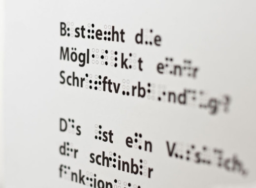
Simone Fahrenhorst, Integrated Design student at Köln International School of Design, wanted to find a solution to an increasing problem: the loss of sight as we age. To help these people be prepared for potential blindness, she created an alphabetic system mixing Braille and Latin signs, and “a new typography that can be seen as a point of intersection between Braille and normal print”, where Latin and Braille letters are designed on the same grid.
Educational, reassuring and readable by both sighted and visually-impaired people, the Learning Braille Type is a very relevant graphic project, both in form and substance.
LearningBrailleType_SimoneFahrenhorst_01
Words are composed with letters in Latin and Braille. Sighted people can then read and understand the signs in Braille by deduction.
LearningBrailleType_SimoneFahrenhorst_02

Kobigraphs

Susan Jolly is the curator of dotlessbraille.org, a website dedicated to “demystifying Braille”. In the 70’s, her father came up with the idea of a Braille analog system called the Kobigraphs. He developed Kobigraphs, “as a simple way of writing Braille in inkprint–much simpler [by hand] than dots”. Based on a Braille cell, Kobigraphs are drawn by joining the dots of a Braille combination. It’s a simple way of increasing Braille literacy by giving everyone the possibility to share the same (paper) “language”.
In 2014, Greg Bland, a young graphic designer, “became curious about the idea of this typographic ‘bridge’ between embossed Braille for the blind and visual letterforms for sighted persons to read Braille more easily”. In order to encourage sighted people to learn Braille, he designed a personal and contemporary Kobigraphs’ alphabet. The result is gorgeous, accessible and touches upon the standard that makes up Brailles.
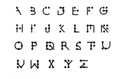
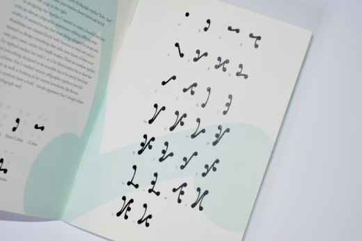
Kobigraphs_GregBland
From A to Z, Greg Bland’s Kobigraphs are drawn by joining the dots of Braille combinations with a single line for each sign, in a dynamic way. To draw a Kobigraph by hand, you don’t need to remove the pen from the paper.

Why only dots?

Dots have not been chosen to write Braille just for fun. Convenience, efficacy and accessibility were selection criteria too ;)! However, Deon Staffelbach, an American designer, asked himself if other shapes than standard dots could add “an additional level of information” to Braille.
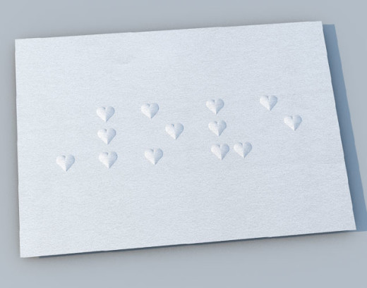
He designed thre “Braille fonts”: Constellation (dots= stars), Love (dots= hearts) and Pyramid (dots= pyramids), each of them having 3 heights of embossment for light, regular and bold. Although these fonts may be difficult to read for long texts (In Search of Lost Time by Marcel Proust with little hearts, really makes you want to go to bed for a really long time), it may be an interesting alternative, depending on the (short) message conveyed, and whether it can understandable for both sighted and non-sighted people.
LoveBraille_Deon
A lovely card on which is written the word “love”, in Braille, every dot is replaced by a heart.

A Tool tool to read everything but Braille

The Fluid Interfaces is a research group of students and alumni at MIT’s Media Laboratory. Their goal is, “to design and develop interfaces that are a more natural extension of our minds, bodies and behavior”. The researchers recently created a tool that can detect and read out loud any printed text.
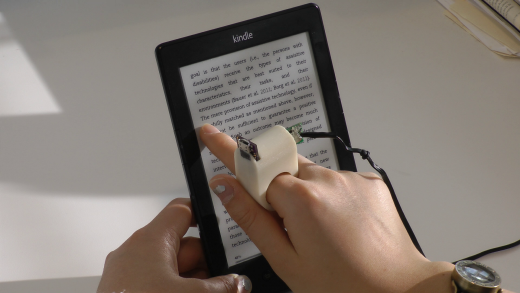
The FingerReader is a prototype ring that allows, “wearers (to) scan a text line with their finger and receive an audio feedback of the words and a haptic feedback of the layout”. This awesome tool will perhaps lead to the death of Braille, but before that it will allow every visually-impaired person to read any written support.
FingerReader-Reading-Kindle
Introductory video to the FingerReader, “a wearable device to explore printed text on the go”.

Textscape

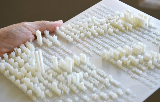
Textscape is a 3D printing technology project by the Chinese artist and designer Hongtao Zhou. The 3D typographic documents offer a double and even a triple reading: letters can be read by both sight and touch, and can also form, thanks to volume and the different heights of signs, an image or a new text to decipher. “These documents make the reading process interactive for general audience or blind people to read as knowledge as well as art”.
Textape_HongtaoZhou
A 3D document representing an embossed text about New York City. Some letters, taller than the other, become the buildings of the city. Seen or touched from above, the document is a text to read, viewed or touched from the side, it offers a typographical architecture of New York. ©Hongtao Zhou

Elia Frames Tactile Font: An alternative to Braille

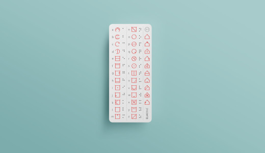
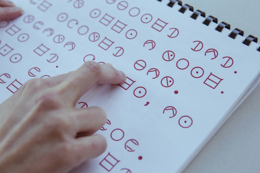
According to its CEO, “Elia is a company founded on the belief that change is not only possible, but inevitable”. The Elia team of engineers and designers recently developed a font that may change the world, and especially the future of Braille’s world. Elia Frames is a tactile font whose design and construction are very different to Braille. Only shapes in relief and reading by touch remained. The Elia Frames’ alphabet is divided into several groups of framed letters.
ELIA_Bookmark_Index
Letters of each group have a common shape, for example letters from the first group (from A to D) are designed with open circular frames while the second group of letters (from E to N) have squared shapes. Numbers have house shape frames. These shapes and divisions aim to facilitate the learning of the writing language by both visually-impaired and sighted people.
ELIA_Reading_Studio_6
Elia Frames is very intuitive and faster to learn than Braille, which should encourage more people to embrace it. The font can be downloaded for free from ELIA’s website. And to print your embossed tactile font, Elia team also worked on Elia Touch Printer (more here about this impressive tool)!
Despite the large decline of use, Braille remains today the only effective method of writing and reading adapted to blind and visually-impaired people. It can not disappear until it has found a better built substitute, which is not for tomorrow. No, tomorrow, designers and researchers will continue to experiment around this unique form.
They will keep questioning readability, like with this “Rubiks Cube for blind persons“, designed by Konstantin Datz (a totally white Rubiks Cube where colors are written in Braille). Tomorrow, they will keep going where no one has gone yet, trying to give visually-impaired people access to more and more (tactile) experiences and (cultural) discoveries.
This is what Philipp Meyer did with the creation of the first “tactile comic for blind people”. And after tomorrow, June 19th, a new kind of book will be released at the Paris headquarters of Unesco: a guide for blind yoga students using a “tactile printing system (…) developed at IIT-Delhi”.
Thinking about design, graphic or type, with all senses, may be the key to richer and more innovative forms of creativity!

Twitteriffic for iOS now uses facial recognition to center friends in pictures

Twitteriffic for iOS has a few new tricks up its sleeve. The app will now take better advantage of Twitter’s cool new quote tweet feature, and use facial recognition software to help you frame your shots.
When someone quotes your tweet, Twitteriffic will give you the option to see notifications on your iOS devices or Apple Watch. Just like you see with retweets, the pop-up notifications let you know you were quoted, and by whom.
The facial recognition feature is designed to deal with sloppy snaps, making  people in an image the main focus.
Twitteriffic also gains a useful gesture control; you can now swipe from the left screen edge to navigate back to the previous screen.

Tuesday has one extra second and that could be dangerous for the internet

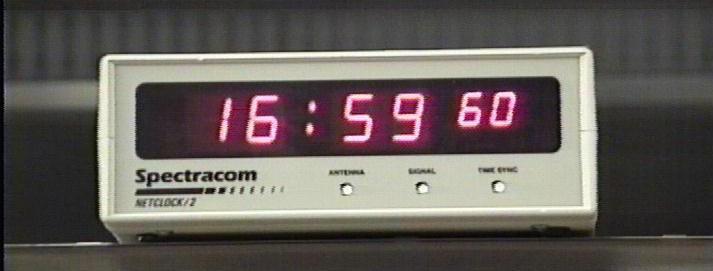
This Tuesday, a single second will be added to clocks around the world to help counter Earth’s rotation slowing down.
Called a “leap second,” it has been added approximately every 18 months since 1972 to rectify ‘lost’ time from the slowing rotation, ensuring that the atomic clock is in sync with Earth.
Humans can handle the additional second without even being aware of it, but computers aren’t quite accustomed to the path of time suddenly changing.
A leap second was last added to the clock in 2012, during a weekend, which wreaked havoc online.
It caused Reddit, Foursquare, Yelp, LinkedIn, Gawker and StumbleUpon to be knocked offline entirely, as well as hundreds of flights to be delayed in Australia.
Many issues were caused by a bug in the Network Time Protocol used to keep Linux system clocks in sync. The flaw caused NTP to lock up some systems entirely, requiring a reboot before they could recover.
When the leap second comes around, it means the system clock sees an additional figure, like so:
2011-12-31 23.59.57
2011-12-31 23.59.58
2011-12-31 23.59.59
2011-12-31 23.59.60 <– leap second
2012-01-01 00.00.00
2012-01-01 00.00.01
2012-01-01 00.00.02
The second will be inserted into network time services at the exact same moment worldwide, on June 30th at 23:59:60 UTC.
This time around it’s critical that businesses are ready, with the leap second being added during a time when trading on stock markets is open.
Some businesses are ready for the leap second to be added, like Google and Amazon, which adjust server clocks gradually over a number of weeks so that it’s not a sudden change.
Others that rely on time-critical systems — like stock markets and utilities — are nervous about it going wrong. A single second of downtime for a stock market means up to $4.6 million could be lost.
Linux systems shouldn’t break tomorrow — the bug that affected them last time has since been resolved, along with other issues found in Java and other operating systems.
The leap second is mostly a headache for system administrators who need to ensure their services are highly available and need to plan how to handle the change. Hardware providers such as Cisco now provide detailed advice on how their hardware handles the leap second, but the side effects are unpredictable.
Leap seconds might not be around for much longer with the International Telecommunications Union planning to vote on a proposal to eliminate the leap second in November 2015.
Impending doom aside, you can enjoy your extra second tomorrow by burning it on John Oliver’s site that shows you a random one-second video.